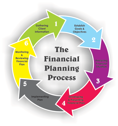
I would rank the first picture as the most effective of the three financial planning processes. This picture gives you a clear starting point and also gives a very accurate description of the cycle; it shows that the financial planning process is continuous and ongoing. I wouldn’t improve on it much because regardless of someone’s financial background knowledge it is relatively easy to understand and explain. The first picture is also the most visually pleasing. The artist uses bright contrasting colors and has numbered the steps clearly so it is easy to follow the process. The use of a circle-shaped chart shows not only that the process is continuous, but that there is not always one specific, clear-cut solution to be found.

The second picture is what I would consider the least effective of the three financial planning processes. This picture is arrow-shaped and seems to indicate clearly the direction in which one should take in the financial planning process. The artist chose to use colors are bright and clearly separate the steps from one another. I feel like this could be improved on in ways as well. This picture implies that only the last four steps are repeated when in reality, that is not the case. I feel like to effectively enforce the process, it must be in a circular shape and all steps must be repeated.

I feel like the third picture is the second most effective of the three financial planning processes. This picture is also circular shaped indicating the unending financial planning process. However, there are also things which I feel the artist could improve upon. The circular shape indicates that the cycle is continuous, but it doesn’t show any kind of starting point which can make this picture extremely confusing, especially for someone who lacks a background knowledge in finance. I feel the artist of this picture also made poor decisions in color choice. The artist chose pastel shades and used the same color three times in the picture and the other colors are not that contrasting. All the colors seem to just blend together.
